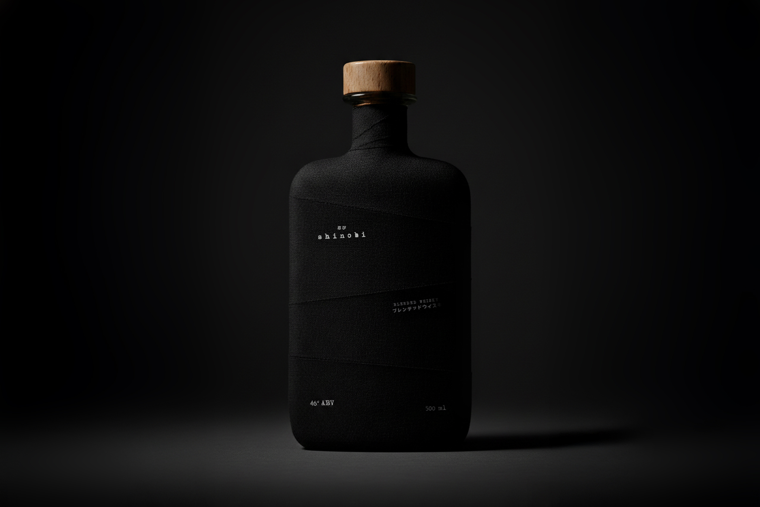
SHINOBI
A Japanese blended whisky built around the idea of concealment as identity.
2026
Client
Nikka
To design a conceptual packaging for a Japanese blended whisky that challenges the traditional visual language of the category, shifting the focus from display and ornamentation to concealment, restraint and silence.
Goal
A brand identity that transforms legacy into a symbol of evolution and clarity.
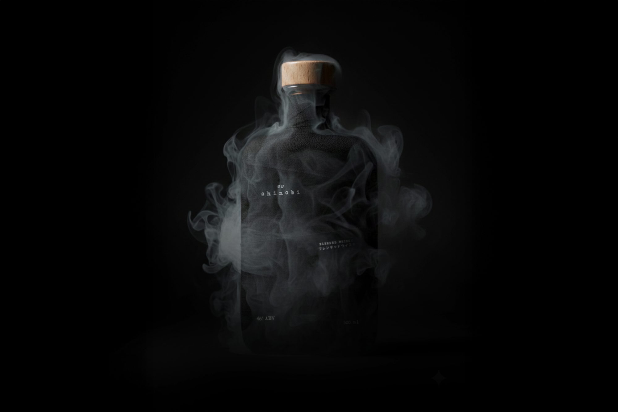
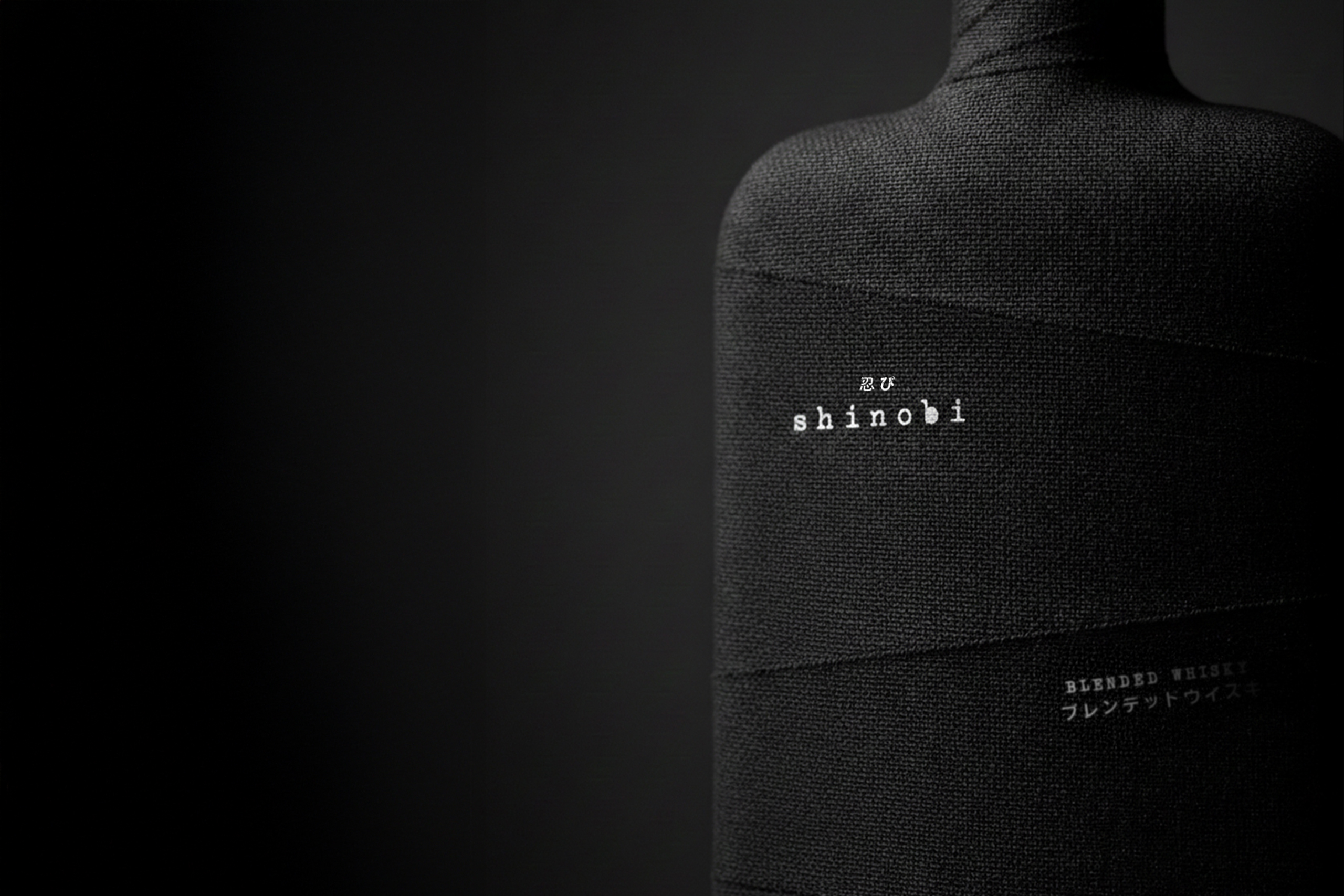
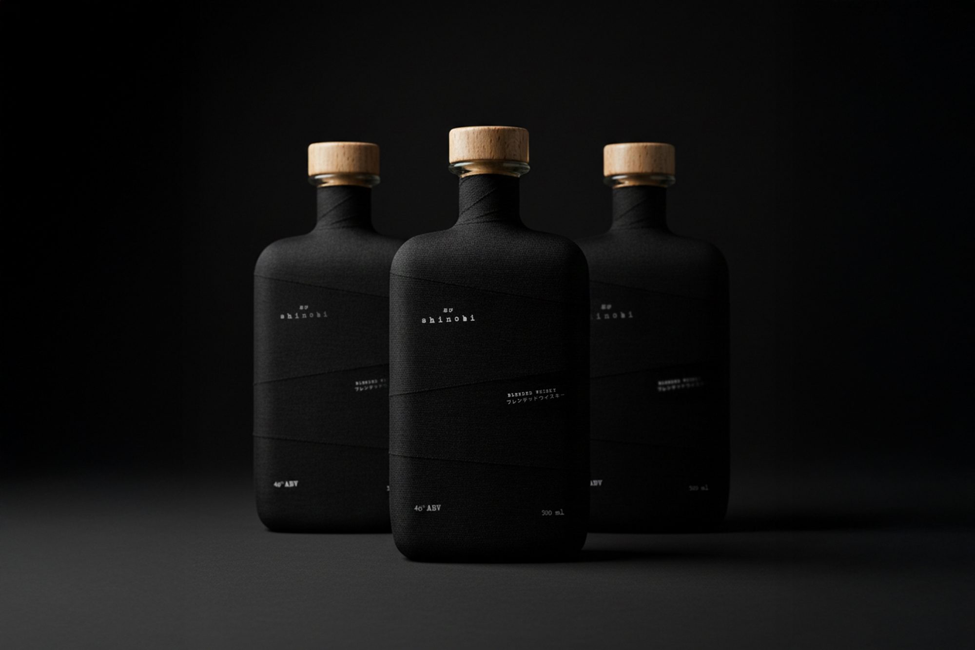
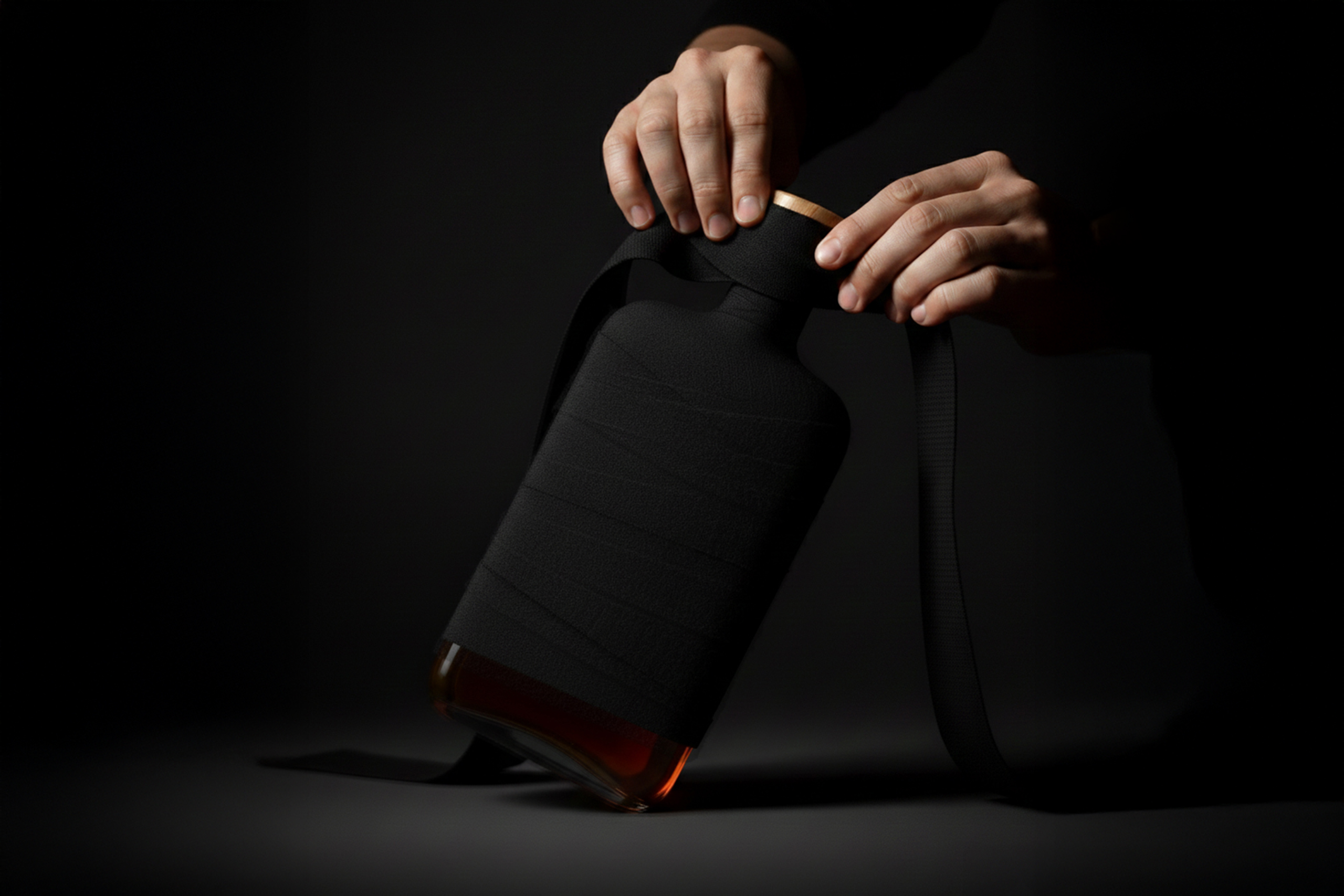
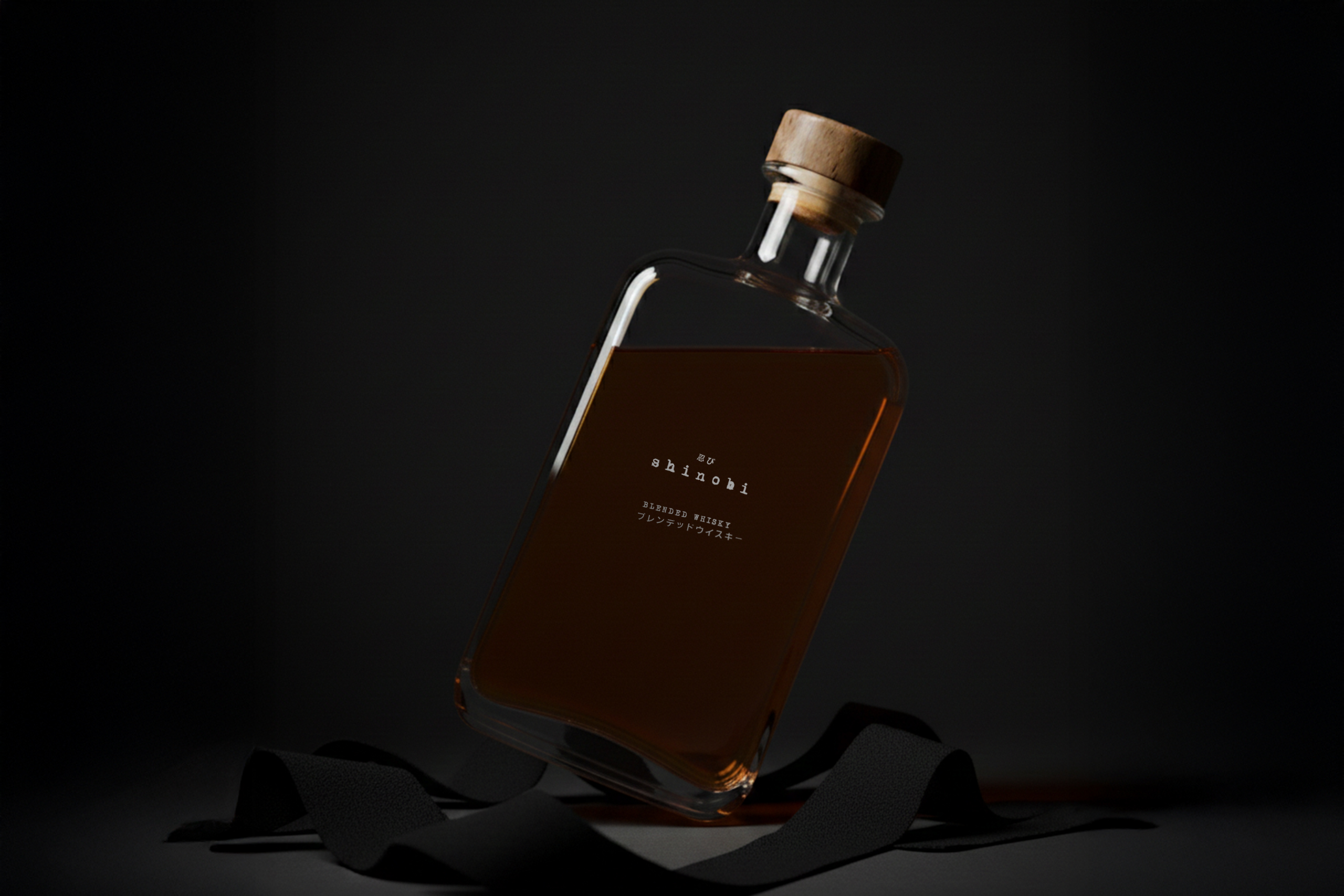
The aim was to translate the essence of the shinobi into a physical gesture, specifically the act of covering the face to erase identity and avoid recognition. The challenge was to create a bottle that does not seek attention, but instead withdraws, allowing identity to remain partially hidden rather than fully revealed.
Result
A brand identity that transforms legacy into a symbol of evolution and clarity.
A packaging concept where the bottle is fully wrapped in black fabric bandages, simulating how a shinobi covers his face to disappear. This intervention transforms the object into something anonymous, where identity is not presented but discovered.
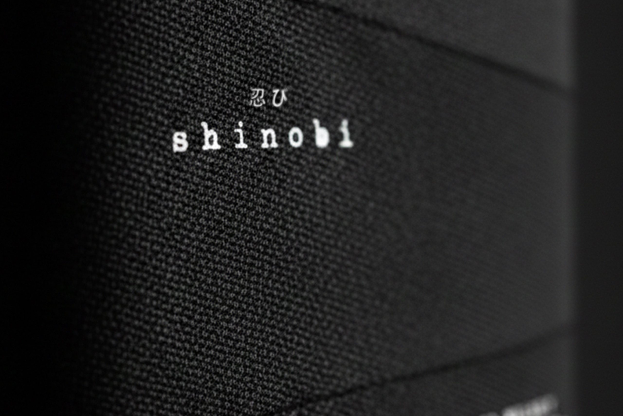
Information is reduced to the essential and printed directly onto the surface, reinforcing a restrained and minimal approach. The result is a packaging system that replaces visual noise with silence, proposing a quieter and more introspective way of understanding spirits design.

